Print Placement on Corporate Uniforms
By The Velocity Wear Team
The left chest is the default position on a work garment, sized to roughly the width of a hand, because it stays visible across a counter and under most layers. A back mark is what carries at distance. Sleeves suit small secondary detail. Anything low on the body disappears the moment an apron goes on, which is the mistake most often discovered after delivery.
Where should a logo sit on a work shirt?
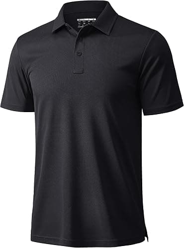
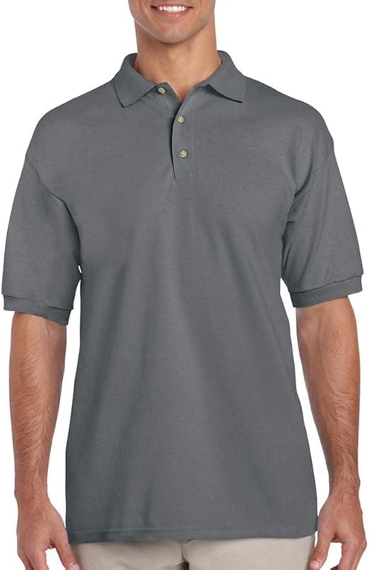
High enough to clear an apron bib and far enough from the placket that it is not distorted by buttons. On a polo that usually means a position level with the underarm seam and offset toward the wearer left. On a shirt with a pocket, the logo goes above it or on it, never across the edge, because the change in thickness shows on both print and stitch.
Think about what is worn over the top. A tabard, a lanyard or a harness will cover a chest mark, and if any of those are standard on your team the back becomes the primary position rather than the secondary one. That is a specification decision, and it is much cheaper to make before production than after.
What size should a chest or back mark be?
A chest mark that reads across a desk is around a hand-width. Larger than that starts to look like merchandise rather than uniform, which matters in a professional setting. A back mark is the opposite: it should be as wide as the panel allows, because its job is legibility at distance and a small logo in the middle of a back reads as an afterthought.
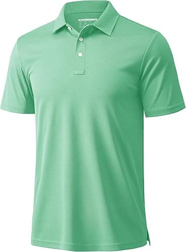
Keep the same physical size across the size run rather than scaling it. A logo scaled up on a 3XL and down on an extra-small makes a lined-up team look inconsistent, and there is no benefit to it. The exception is a full-width back mark, which has to follow the panel. The comparison between contained placements and full coverage is set out in all-over print vs placement print.
Do sleeves and aprons need separate artwork?
Usually, yes. A sleeve is narrow and curved, so a logo designed for a chest panel rarely transfers without being redrawn, and a horizontal wordmark often works better there than a stacked mark. Aprons have their own constraint: the bib is the only flat area, straps cross it, and the pocket line sits right where a logo wants to be. Both are worth proofing separately rather than assuming one file covers the programme.
Decoration method interacts with this. Stitched marks handle curved panels better than large prints do, and the choice between a flat stitch and a raised finish is covered in embroidery vs puff embroidery on corporate uniforms.
How many placements before the price moves?
Each placement is a separate operation, so a chest and a back is more work than a chest alone and the quote reflects it. The effect is modest next to quantity: $20 per piece is the published starting price at fifty, and the tiers at 100, 250, 500 and 1,000 take up to 35% off that. Two placements at a higher tier routinely cost less per garment than one placement at the minimum. The wholesale uniforms page covers the garment range, and the glossary explains the placement terms used on a proof.
Decide the positions once and then hold them across the whole programme. A chest mark that sits at one height on the polos and two centimetres lower on the shirts looks careless when both are worn in the same room, and nobody can say quite why. Recording the measured position alongside the artwork file means every reorder and every new garment added later lands in the same place without anyone having to remember the original decision. It takes one line on the specification sheet and it saves a comparison that would otherwise only happen once the garments are already in the building.