Corporate Uniforms for Trades: print or embroidery
By The Velocity Wear Team
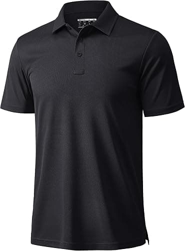
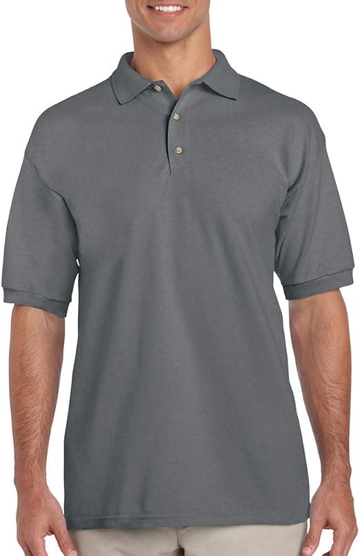
On trade workwear, embroidery is the durable option for chest and sleeve marks, and screen printing carries the large back panel where a company name has to be readable at distance. DTF suits detailed artwork, and 3D puff gives a raised mark on caps. The deciding factor is abrasion: whatever sits on the surface of a garment is what a site wears away first.
Different garments in the same programme can take different treatments without looking inconsistent. A stitched mark on the polos and a printed panel on the outer layers reads as one identity provided the artwork, colours and placements are coordinated. Insisting on a single method across every item usually means compromising on at least one garment, because what suits a lightweight summer shirt is rarely what suits a heavy winter layer. Choose per garment and coordinate the look rather than the process.
Which decoration lasts on site?
Stitching, because it is worked into the fabric rather than laid on top of it. An embroidered chest mark on a polo will still read after the garment itself looks tired. Screen printing is durable when properly cured and is the sensible choice for large coverage, where the stitch count for equivalent embroidery would be impractical and heavy.
Abrasion points matter more than the method in isolation. Anything decorated where a harness, a tool belt or a shoulder load sits will degrade faster regardless of how it was applied, so move the mark rather than blaming the process. The full set of methods is listed with the range on the wholesale uniforms page.
What does hi-vis fabric do to a print?
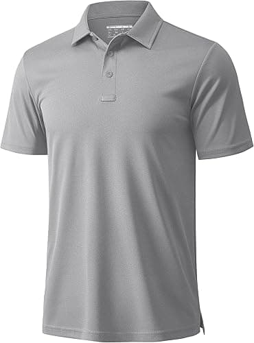
It changes the rules. High-visibility garments are built to be seen, and decoration placed across the reflective or fluorescent areas can interfere with what the garment is there to do. Branding on hi-vis is normally kept to defined panels that leave the visibility features intact, which is why placement on those garments is agreed before artwork is finalised rather than after. Our piece on branding hi-vis and site layers goes into the detail.
Colour behaves differently on fluorescent fabric too. Inks that look correct on a navy polo can read oddly on yellow, and this is one of the clearest arguments for taking the £150 sample before a full crew order. That fee is credited against the bulk order afterwards.
Where do you put a company name so it is readable?
Across the upper back, sized to be read from across a compound rather than from arm's length. That position stays visible when someone is working, facing away or wearing a harness over the front. A chest mark handles close-range recognition and a sleeve mark works as a secondary. The programme mix for site teams is outlined on the construction and trades page.
Does the back print need to match the chest?
It needs to be the same brand, not the same artwork. A full logo lockup that works at chest size often becomes illegible when enlarged, and a stripped-back wordmark reads far better at back-panel scale. Supplying both versions in vector at brief stage avoids anyone improvising a resize. The inputs a supplier needs are listed in briefing a supplier for corporate uniforms.
Decide what else goes on the garment before artwork is approved, because additions later are a new specification rather than an amendment. Contact numbers, a website, a division name and any accreditation mark all compete for the same panel, and a back print carrying four separate pieces of information reads as none of them at distance. Pick the one thing a passer-by should take away and let the rest live on the van.