Corporate Uniforms for Cafes: print or embroidery
By The Velocity Wear Team
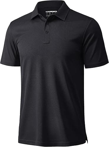
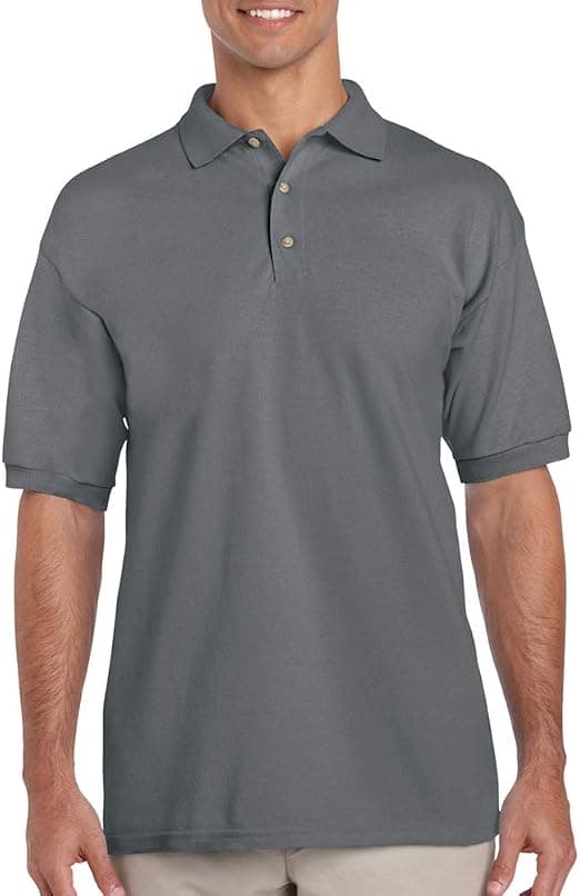
For a cafe, the usual answer is print on the apron and the tee, embroidery on the polo and any outer layer. Coffee shop logos tend to be detailed — a mark, a wordmark, sometimes a founding date in small type — and that level of detail belongs in print, where it holds at chest size. Thread is reserved for the garments where permanence matters more than detail.
What suits an apron versus a tee?
An apron is a flat, stable panel with a large printable area, and it is the best surface in the whole cafe kit. A full logo lock-up works there, centred or set on the bib, at a size that would be impossible anywhere else. It is also the garment guests look at most, since it faces them across the counter.
A tee is softer and moves constantly, so a large stiff print across the chest creases and a lighter application sits better. DTF handles full colour on a tee without the weight; screen printing takes over when the run is big and the artwork is a few solid colours, because the cost per piece falls as quantity rises. The wholesale uniforms page lists the methods available across the range.
How do you handle a detailed cafe logo?
Decide which parts of it survive at small sizes and which do not. A typical independent cafe logo has a symbol, a name and something underneath — an establishment year, a location, a strapline. In print, all three hold at chest width. In thread, the bottom line usually closes up and the symbol loses its fine strokes.
The practical route is to use the full lock-up on the apron, where there is room, and a simplified version — the symbol, or the name alone — wherever embroidery is used. That reads as intentional rather than as a compromise, and it keeps the kit coherent. Supply vector artwork with the fonts outlined, and specify the size you want the mark to be rather than leaving it to be scaled. The restaurants and hospitality kit page shows how the pieces typically sit together.
Is embroidery worth it on a low-cost garment?
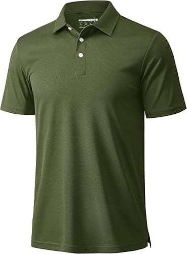
On a polo or a softshell, yes. Those garments last, they are worn in front of guests, and a stitched mark still looks right after a hard year. On a tee that is going to be ruined by espresso within six months, embroidery is money spent on the wrong part of the problem — print it, and budget for replacement instead.
Decoration is a minor line in the overall cost at cafe volumes; the garment side is where the budget actually moves. One more decision to make at the same time: neck labelling. Custom woven labels, tear-out labels and swing tags are produced inside the 10 to 15 working day window and cannot be added afterwards, so choose before artwork approval rather than during production.
Think about the garment colour at the same time as the decoration, because on a cafe floor the two are one decision. A pale shirt shows every splash and a very dark one shows dried milk, and a print that looks sharp on white can disappear against a mid-tone. Choose the colour that hides a working day first, then check that the logo still reads against it. Doing it the other way round produces kit that looks right in a mockup and tired by ten in the morning, which is the most common complaint about cafe uniforms and the easiest one to avoid.