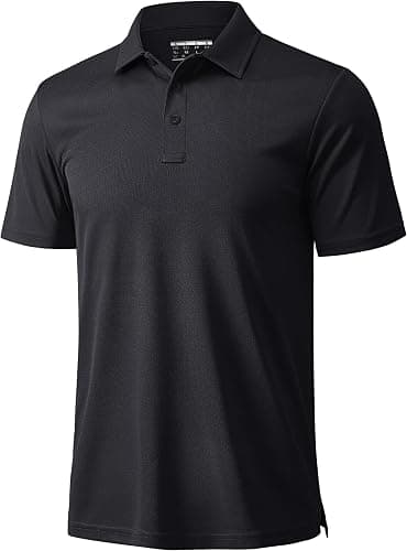
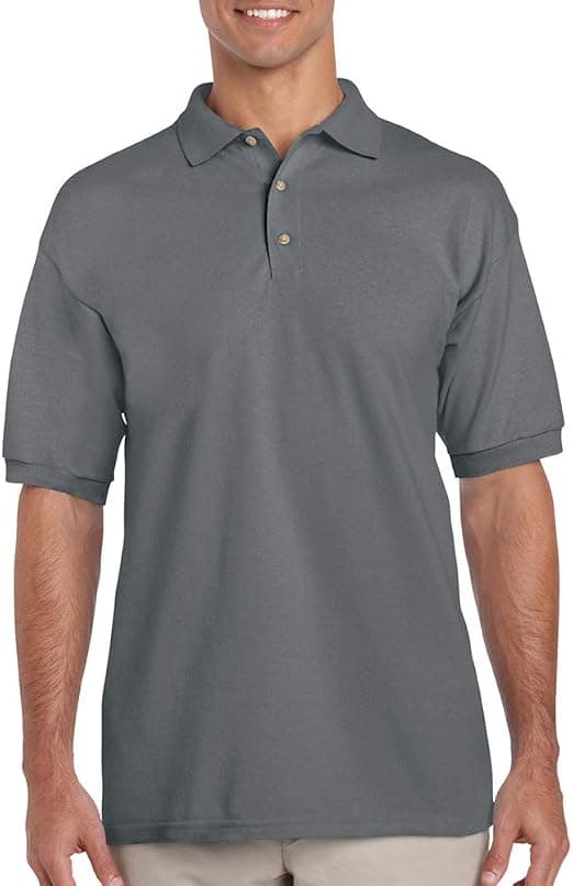
Colour Matching Bulk Corporate Uniforms
By The Velocity Wear Team
A printed or stitched logo can be matched very closely to a Pantone reference. A dyed garment body is a different problem: stock fabric comes in the shades the mill produces, so the match is to the nearest available colour rather than an exact hit. Knowing which of those two you are asking for is most of the conversation, and it is worth having before the quote.
How close can a printed colour get to a Pantone reference?
On a screen print, very close. Ink is mixed to the reference and laid on a known base, so the result is predictable and repeatable between runs. Embroidery works to a fixed thread palette, so the answer there is the nearest shade rather than a mix, and we show you that choice before the machines run. Sublimation and DTF both sit somewhere in between, with the substrate having more influence than either.
Send the Pantone reference itself rather than a hex value or a screenshot. A hex code describes light and a Pantone reference describes ink, and converting between them is where most disappointing matches begin. Our broader notes on colour matching in custom apparel cover that gap in detail.
Why does one colour look different on two fabrics?
Because the fibre changes how the dye sits and how the surface reflects light. Cotton absorbs and softens a colour; polyester holds it brighter and slightly cooler. The same reference applied to a cotton apron and a blended polo will read as two shades of the same colour under office lighting, and the difference widens under daylight.
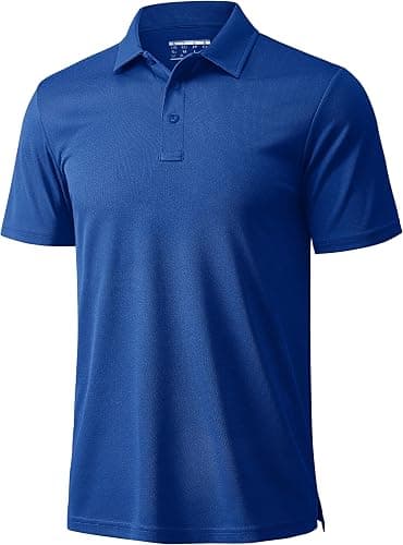
Texture does the rest. A flat woven shirt reflects light evenly, while a piqué knit breaks it up across the surface and reads slightly muted. Neither is a fault, and both are predictable once you have seen the fabrics side by side. The glossary covers the terms used in that part of a quote, and can two different garments match in colour works through the same question across garment types.
What causes variation between two batches?
Dye lots. Fabric is dyed in batches, and two batches of the same specified colour can differ slightly even from the same mill. Over a large programme that means a reorder eighteen months later may not sit perfectly against the original stock. It is a known property of dyed textiles rather than an error, and the way to manage it is to order more at once instead of topping up repeatedly.
That happens to align with the pricing. From $20 per piece at the fifty-piece floor, the discount rises through the tiers at 100, 250, 500 and 1,000 to a maximum of 35% against the opening rate. One larger order therefore gives you better consistency and a better price, which is rare enough to be worth acting on.
How do you protect a brand colour across a rollout?
Three habits. Supply the reference in the right form. Approve a physical sample rather than a screen image, which is what the £150 sample fee buys you and it is credited against the bulk order. And keep one approved garment aside as the reference for every future order, so a comparison is always against something physical. The wholesale uniforms range runs shirts, polos, aprons and outer layers, so if the programme spans several fabrics, ask to see them together before committing.
Be realistic about where precision is worth paying for. A logo has to be right, because it is the brand asset people recognise. A garment body in a close neighbouring shade is usually indistinguishable once it is on a person and moving, and chasing an exact match there can cost far more than the difference is worth. Deciding in advance which elements are fixed and which have tolerance makes the whole conversation shorter and the quote cheaper, and it stops a minor shade question holding up an otherwise finished specification.