T-Shirts for Clothing Brands: print or embroidery
By The Velocity Wear Team
For a clothing brand, decoration is a positioning decision as much as a technical one. Screen printing suits flat-colour graphics and repeat runs. DTF handles photographic and many-coloured artwork without separations. Embroidery and 3D puff put a raised, stitched mark on the garment that reads as premium at small scale. Most ranges use two of these across the line rather than one everywhere.
Which decoration reads as a brand rather than a blank?
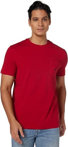
Restraint, generally. A small embroidered chest mark on a heavier 240 GSM boxy tee reads as a product; the same logo printed six inches wide reads as promotional kit. That is not a rule about taste, it is about what customers have been trained to associate with price. Pair the decoration with the private label programme — woven neck label, swing tag, packaging — and the whole thing lands differently. The clothing brands page sets out those options.
When does screen printing beat DTF?
Whenever the design is flat colour and the run is deep. Screen setup is charged per colour and per position and does not scale with quantity, so a three-colour back graphic across 500 pieces is where screen printing pulls clearly ahead. DTF has no screens at all, which makes it better for short runs, for photographic art, and for designs with gradients that would need an unreasonable number of separations. Both are listed on the wholesale t-shirts page alongside sublimation.
There is a feel difference as well. A heavy screen print has weight to it and softens over several washes. DTF lays a thin film that sits flatter but covers the area you printed. On a lightweight 150 GSM tee that distinction is easy to notice and easy to test on a sample.
Where do embroidery and 3D puff fit?
Embroidery belongs on marks, not on murals: a chest logo, a sleeve badge, a small hit above the hem. It is thread rather than a coating so it outlasts everything else, and it is the single fastest way to make a tee feel like a garment. It gets expensive and heavy as stitch count rises, which is why nobody embroiders a full-chest illustration. 3D puff raises the stitching or the ink so a wordmark stands proud — excellent on bold type, poor on fine detail, which it loses.
How does decoration interact with private label finishing?
They should be decided together. A tear-out label means the customer removes the branding from the neck, so the garment relies on the print or the embroidery to carry it. A woven label that stays in does the opposite and lets the outside stay quiet. Screens, labels and tags all need approving before the 10 to 15 working day production window opens, so settling them in one pass saves real time. Our cost breakdown covers what each layer adds, and comparing blank bases covers the garment underneath it all.
Should a range use one method throughout?
Not necessarily, but the variation should look deliberate. A useful pattern is a tiered range: embroidered marks on the heavier pieces at the top of the price list, screen printed graphics through the middle, and DTF reserved for the one artwork-led piece that could not be produced any other way. The customer reads that as a range with structure rather than as inconsistency.
What does read as accidental is the same logo appearing embroidered on one shirt and printed on another at the same price. If two garments sit beside each other on a rail, keep the mark consistent between them and let the difference live in the garment instead.
Whichever pattern you settle on, write it down as a rule for the brand rather than deciding afresh each season. Decoration choices made one drop at a time drift, and two years later the range has no visual logic anybody can explain to a stockist.