T-Shirts for Cafes: print or embroidery
By The Velocity Wear Team
For cafe staff kit, embroidery on a small chest logo is the most durable option because thread cannot crack or fade the way a coating can. Screen printing is the better value for larger flat-colour graphics and for back prints. DTF handles detailed or multi-coloured logos that would need too many screens. The deciding factor is usually wash frequency rather than appearance.
Which decoration survives a cafe wash cycle?
Embroidery, by a clear margin. It is stitched into the fabric rather than sitting on top of it, so hot washes and industrial detergents do not degrade it. A properly cured screen print is a close second and holds up well for a long time. What fails fastest is a large, heavy print area washed hot several times a week, because the ink and the cotton move at different rates. All the methods we run — screen printing, DTF, embroidery, 3D puff and sublimation — are listed on the wholesale t-shirts page.
Is embroidery worth it on a tee?
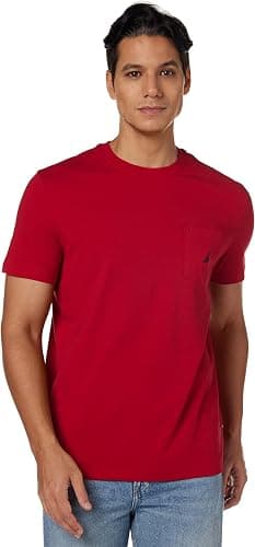
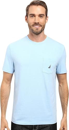
On a left-chest mark, yes. It costs more per piece than a single-colour print, but it lasts the life of the garment and it reads as considered rather than promotional, which matters on a shirt a customer is looking at across a counter all morning. Where it stops making sense is scale — stitching a large graphic makes the panel stiff and heavy, and on a lightweight cotton it drags. Keep embroidery to logo size and print anything bigger.
Which method suits a detailed cafe logo?
Fine detail is where cafes get caught out. A logo with thin line work, small type or a gradient will lose detail in embroidery, because thread has a minimum practical stitch size, and will need an unreasonable number of screens to print conventionally. DTF prints full colour without separations, so it handles that kind of mark cleanly. If the logo has an illustrated element and a wordmark, it is often worth simplifying to a single-colour version for the garment rather than forcing the full artwork onto a shirt. A £150 sample credited against the order is the simplest way to settle that argument — our sampling guide covers what to look at.
What about aprons and the rest of the kit?
Aprons are heavier and take embroidery particularly well, so a cafe running embroidered aprons and printed tees ends up with a mismatch in how the logo reads. Either keep the method consistent across the kit or make the difference deliberate — embroidered mark on the apron and supervisor polo, printed on the tees. Caps from $12 and polo shirts from $18 both suit embroidery. The restaurants and hospitality page shows the full uniform line, and our cost guide covers how the minimums stack when you order several products at once.
How big should the logo be on a staff tee?
Smaller than most people first ask for. A chest mark of roughly three to four inches wide is legible across a counter without turning the shirt into signage, and it is what reads as a uniform rather than an advertisement. A large front graphic works for a merchandise tee you sell to customers, which is a different product with a different job.
Where a bigger hit does earn its place is the back, above the shoulder blades, because that is what a queue looks at for several minutes while waiting. A small chest mark with a larger back print is a combination that works well in hospitality and costs one extra setup rather than a second order.
Whichever you choose, see it on a body before committing. A logo that looks balanced on screen frequently sits an inch too low once the shirt is on somebody, and an apron worn over the top can hide a chest mark entirely.