Jackets & Outerwear for Offices: print or embroidery
By The Velocity Wear Team
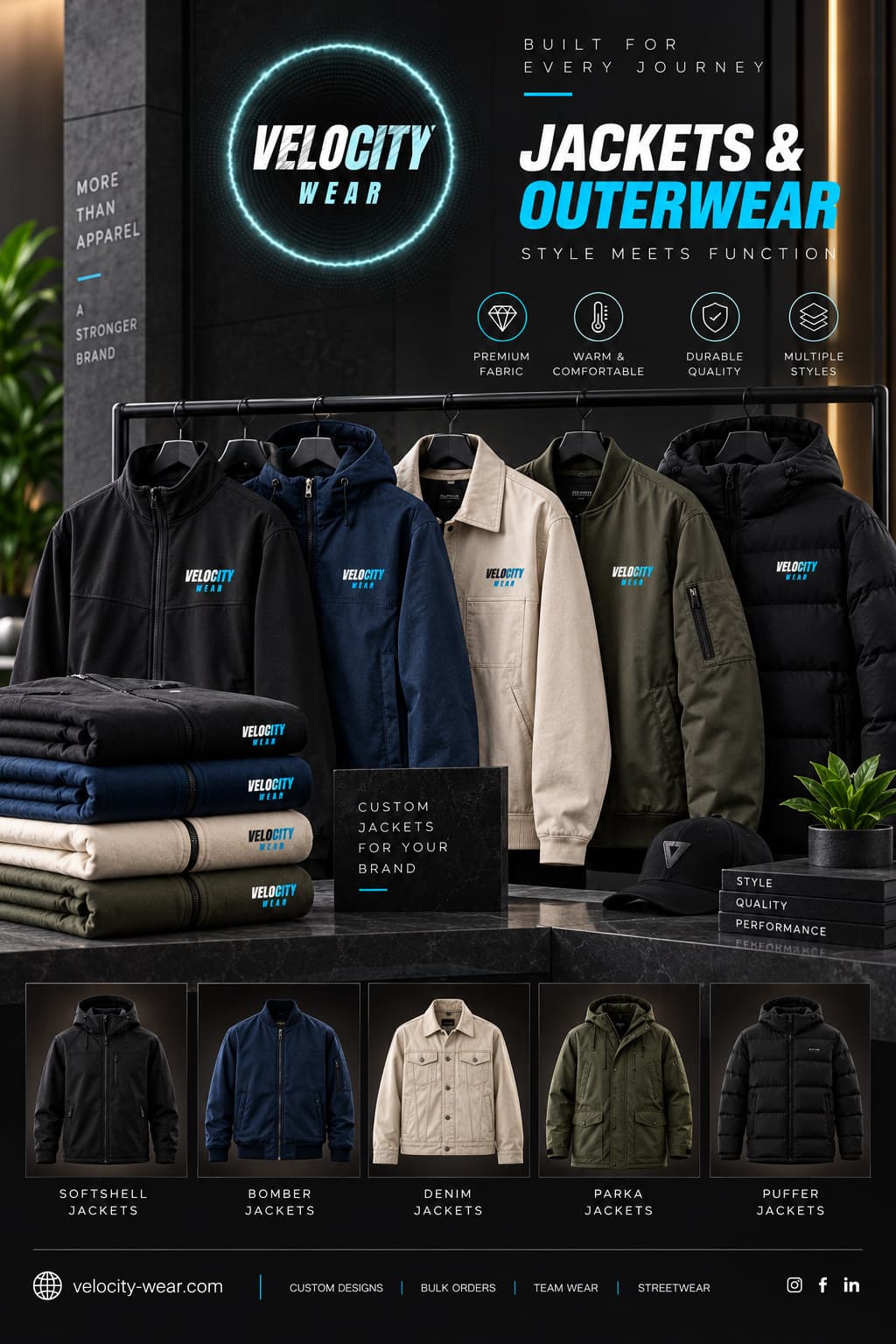
For office outerwear, embroidery is the default and a small one at that. A stitched left-chest mark reads as a uniform; a large printed block across the back reads as promotional merchandise, and staff quietly stop wearing it. Print earns its place on quilted styles, where stitching through a baffle is a bad idea, and on artwork with detail that thread cannot hold.
Which decoration reads as corporate rather than promotional?
Restraint does. The rule of thumb is that a jacket somebody would wear at the weekend is a jacket they will wear to a client meeting, and the fastest way to fail that test is to brand it everywhere. One chest mark, roughly the width of a business card, is the safe specification. A discreet second mark on a sleeve or between the shoulders is acceptable on kit for a site visit or a conference stand. Everything beyond that turns a garment into signage. Style options are listed on our wholesale jackets page, and the way small firms tend to approach this is covered on the corporate and offices page and in corporate clothing for small UK firms.
Can a logo with fine detail be embroidered on outerwear?
Up to a point, and the point arrives sooner than most brand guidelines assume. Thread has a physical width, so hairlines, small text below about four millimetres in height and gradients all need rethinking before they can be stitched. The usual solution is a simplified mark for garments: the same logo with the fine detail removed and the colours flattened to a small palette. That version then becomes the one used on every garment you ever order, which is better for consistency than letting each supplier improvise. Where the detail genuinely cannot be lost, DTF prints it exactly as drawn.
Thread choice matters too. A logo stitched in a colour close to the jacket is subtle and expensive-looking; the same logo in a high-contrast thread is louder and easier to recognise across a room. Neither is wrong, but the decision should be deliberate rather than a default.
How many logo positions does an office jacket need?
One, usually. Each additional position is handled separately on every garment, so it adds to the per-piece figure without adding much recognition. If a second is justified, a small mark at the nape or on the upper sleeve is better value than a back block, because it is visible when the wearer turns without dominating the garment. Comparing how the different builds take these positions is the useful exercise, and our jackets buyer guide sets the styles against each other.
What about a jacket that has to work outside the office?
Then choose the garment first and the decoration second. A waterproof shell with a taped membrane is better served by a transfer than by needle holes. A heavy varsity or coach style will take embroidery, appliqué or twill happily. Whichever you land on, the fifty-piece minimum, the 10 to 15 working day production window from artwork approval and the £150 credited sample all apply the same way, so a decoration decision can be tested on a real garment before fifty of them are committed.
Set the artwork rules down once and reuse them. A garment version of the logo, a fixed chest width in millimetres, an agreed thread reference and a note of where the mark sits relative to the shoulder seam make up a short document that every future order can be run against. Without it, each order drifts slightly, and after three years the jackets in the building no longer match one another. That drift is invisible while it happens and painfully obvious in a company photograph.