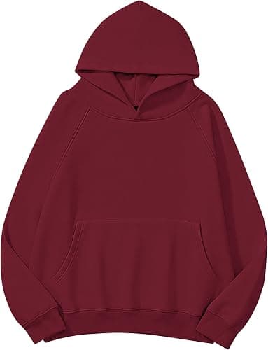
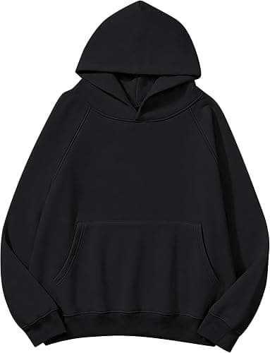
Colour Matching Bulk Hoodies
By The Velocity Wear Team
Give us a Pantone reference, not a hex code or a JPEG. Pantone describes a mixed ink; a hex code describes light on a screen, and the two do not translate. Even then, the same ink prints differently on brushed fleece than on smooth cotton, and a dyed garment body is matched to a different Pantone system again. Expect close, specified in advance, rather than identical.
Why does the colour shift between screen and fabric?
A monitor emits light and a hoodie reflects it, so a saturated blue that glows on a laptop lands quieter on fleece. Brushed-back fabric makes this stronger: the raised nap scatters light in every direction, which softens the edge of a print and takes a little brightness out of it. Darker garment bodies pull printed ink towards themselves unless a white underbase is laid down first, and that underbase itself changes the final tone slightly. None of this is a fault; it is what ink on textile does.
The practical consequence is that you should approve colour on fabric, not on a rendering. A printed strike-off on the actual fleece, or a full sample hoodie at £150 credited against the bulk order, is the only thing that tells you what you are getting. A digital mockup will show you placement and scale accurately and colour approximately, and that distinction is worth understanding before you sign anything off.
What is the difference between matching a print and matching a garment?
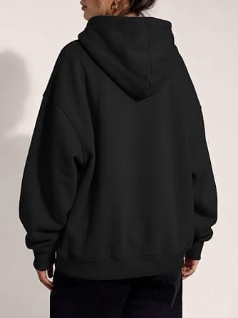
Matching a print means mixing ink to a Pantone solid coated or uncoated reference. It is controllable, repeatable within a run, and usually lands close. Matching the garment body is a different job: the fleece is dyed as fabric, and dye behaves differently from ink. A precise body colour normally means a custom dye lot, which carries its own minimum and adds time. Most buyers choose the nearest stock colour for the body and keep the exact brand colour for the print, which is the cheaper and faster answer.
Where two different garments have to match each other, the problem multiplies, because a cotton fleece and a polyester shell take dye differently even from the same bath. That specific problem is worked through in can two different garments match in colour, and it is worth reading before you promise a client a matching set.
What causes batch variation, and how much is normal?
Fabric is dyed in lots. Two lots of the same colour reference can sit fractionally apart, and the gap is visible if you hold garments side by side under bright light and invisible if you do not. Ink is mixed per run too, so a repeat order six months later is matched to the reference rather than to your previous delivery. The way to control this is to order the full quantity you need in one run wherever possible, and to keep a physical retained sample from the first run so a repeat has something real to be matched against.
Multi-colour artwork adds a second variable, because each colour is a separate screen and the registration between them has a tolerance. Artwork with fine detail in three or four colours is where this shows. If your logo has gradients or photographic elements, ask about DTF or sublimation instead of screen printing, and read colour separation for screen printing first so you know which questions to ask.
What should be written into the order?
- The Pantone reference for every print colour, coated or uncoated stated explicitly.
- The garment body colour by its stock name, with the nearest Pantone noted for the record.
- Whether a white underbase is being used on dark bodies.
- Who approves the strike-off, and the deadline for that approval.
Getting those four lines into the order stops the argument that otherwise happens on delivery day. The current from-price and decoration options are listed on the wholesale hoodies page, and the vocabulary a printer will use back at you is defined in the apparel glossary.