Caps for Bands: print or embroidery
By The Velocity Wear Team
Embroidery holds a band logo best when the mark is bold and simple. Print and DTF handle detail, fine line work and flat multi-colour artwork. Sublimation opens up full-panel graphics on the right blank, and 3D puff raises a chunky wordmark into something with real presence on a merch table. The artwork usually decides, and the blank decides what is left.
Which method holds a band logo?
Embroidery, if the logo survives being simplified. Band artwork is often drawn for a twelve-inch sleeve — thin strokes, texture, distressed edges — and none of that reproduces in thread at cap-front size. What does reproduce is a strong silhouette, a short wordmark or an emblem with clear internal spaces. If the logo only reads when it is big, embroidery will fight it.
Print is the alternative rather than the consolation prize. DTF and screen printing both hold detail that stitching loses, and for a band whose identity sits in a specific drawn mark, keeping that mark intact matters more than the texture of thread. The decoration methods we run are listed on our wholesale caps page.
What does the blank do to your options?
It narrows them before you start. A six panel has a centre seam running up the front, so wide artwork either sits to one side or gets interrupted. A five panel gives an unbroken canvas. A trucker’s foam front is made for a bold panel treatment and reads loud from across a room. A dad cap is soft, so a dense stitched badge can pull the front out of shape.
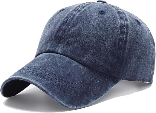
Pick the blank and the method together. Choosing a dad cap because it suits the band and then trying to force a heavy crest onto it is the most common way a cap sample disappoints. Custom trucker caps: foam fronts, mesh and patches goes into what that particular blank does well.
What about 3D puff and multi-colour work?
3D puff raises the embroidery off the panel and suits short, thick lettering. It is a distinct process with its own setup, and it does not rescue a detailed design — if anything it demands a simpler one, because the raised stitching swallows fine internal detail. Used on the right wordmark it is the single most striking thing you can put on a cap front.
Colour count matters more in print than in embroidery, and positions matter more than either. One front decoration is what the entry price assumes; a side panel or a rear position adds to every cap in the run. Our bands and music page covers how the merch mix balances out.
How do you check the artwork will work?
Print it at the real size and look at it from three metres, which is roughly the distance from which someone decides whether to walk over to the table. If it turns into a smudge, simplify it. Do that before approval rather than after, because after approval the schedule is already running.
Then consider a sample. £150, credited against the bulk order, and it turns every one of these judgements from an opinion into a fact. On a first design with unfamiliar artwork it is the best-value insurance available.
The blank colour deserves as much thought as the artwork itself. A mark that works on black can disappear on a mid-tone, and both thread and ink behave differently against a dark ground than a light one. Where a band has one strong logo, running it on a dark cap and a light cap is two designs and two lots of fifty, so the colour is a commitment rather than a variation. Choose the one that suits the artwork first and the one that suits the audience second.