Artwork Setup for Custom Joggers
By The Velocity Wear Team
Send vector artwork wherever you have it, or a raster file at 300 DPI at the final printed size. Name the colours against a reference rather than describing them. Then check the design against a jogger leg specifically, because a narrow curved panel with a seam down one side will not carry a layout drawn for a chest.
What file should you actually send?
Vector is the first choice for any logo, badge or type-led mark. Vector scales to any size without losing an edge, separates cleanly into screen printing colours, and converts to an embroidery file with far less interpretation. Keep the type as outlines so a missing font cannot silently substitute itself.
Where the design is photographic or painted, vector is not an option and raster is correct. In that case the rule is 300 DPI at the size it will be printed, not at the size the file happens to open. A 300 DPI file scaled up to fill a thigh is no longer 300 DPI. There is more on that arithmetic in what 300 DPI actually means, and the spec options sit on the wholesale joggers page.
How does a jogger leg change the design itself?
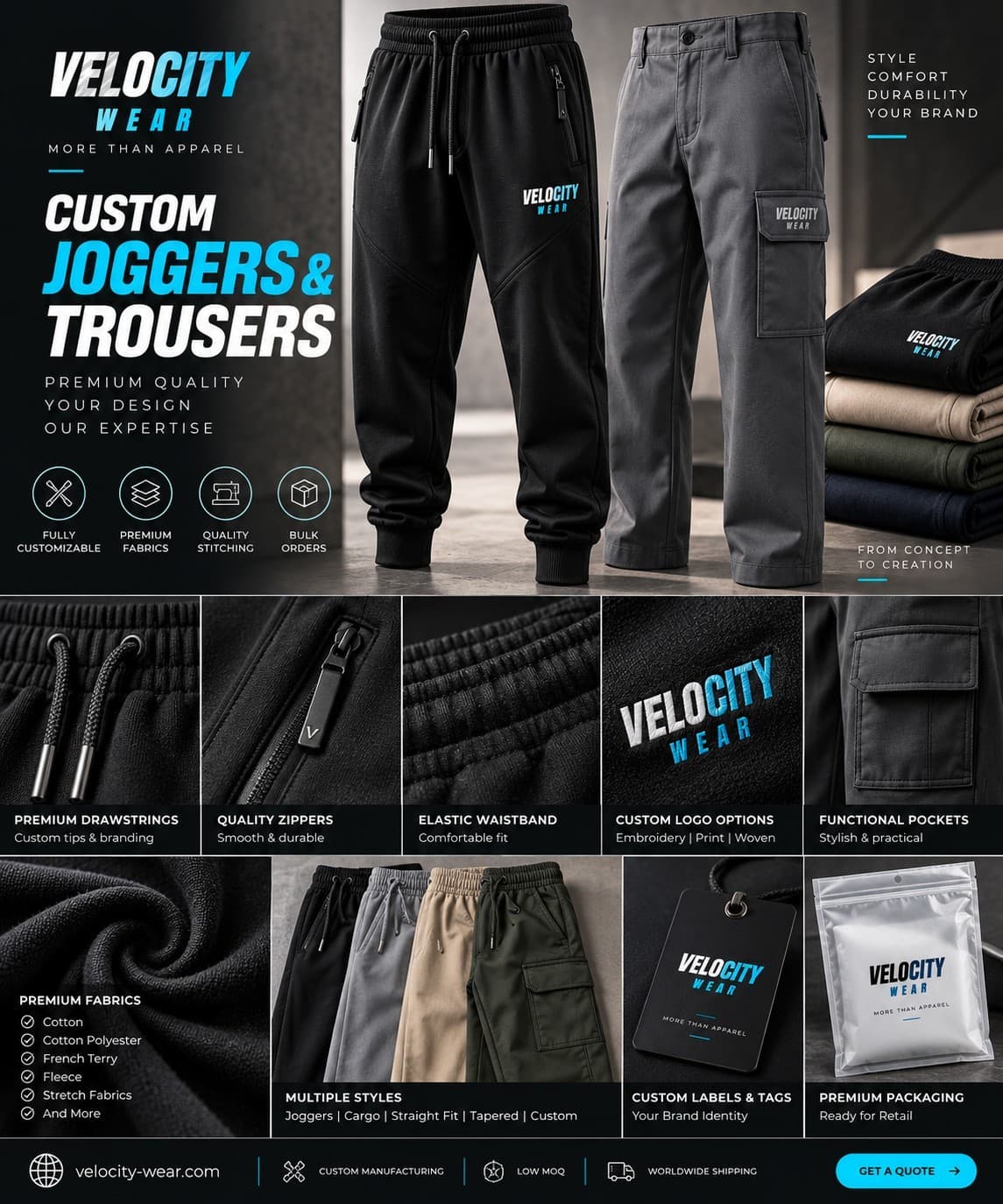
The usable area is a tall, narrow rectangle on the outer thigh, bounded by a side seam and the pocket construction. Artwork that runs vertically fits it naturally. Artwork drawn wide, which is most logos, either has to shrink until the detail is lost or has to be redrawn in a stacked arrangement.
Plan for that early rather than discovering it on a proof. A lock-up drawn specifically for the leg, plus a small mark for above the cuff, gives you two usable assets rather than one compromised one. Also keep everything clear of seams: decoration that crosses a seam sits unevenly and will not press or stitch consistently across the run.
How should colour be specified?
Give a reference number, not a description. Screen inks are mixed to a reference, and embroidery threads are matched to the nearest available shade in the thread range, which is a match rather than a reproduction. A fabric also shifts perceived colour: the same ink looks different on black brushed fleece and grey marl loopback.
Say which colour is critical if one of them is. Brand marks usually have one shade that has to be right and several that can move slightly, and telling us that up front focuses the matching effort where it counts. What can and cannot be held exactly is set out in colour matching and why Pantone never looks quite right.
What happens between sending artwork and approving it?
We prepare the production file: separating colours for screens, digitising for embroidery, or building the print file for DTF. Then you receive a proof showing position, scale and colour reference on the garment. That proof is what you sign off, and signing it starts the 10 to 15 working day production window.
Check the proof against the garment rather than against your screen. Measure the print width against the actual leg, look at where the mark sits when someone is standing, and confirm the size grid at the same time. After approval the spec is locked into cutting and screens, so a change means a fresh run of fifty at whichever tier on the pricing page applies. Our broader artwork preparation guide lists what to check before you send anything.