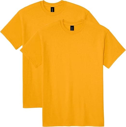
Colour Matching: Why Your Pantone Never Looks Quite Right
By The Velocity Wear Team
Brand colour is one of the most common sources of disappointment in custom apparel, and almost all of it comes from an assumption that a Pantone number is an absolute. It is a standard for a specific ink printed on a specific paper. Everything else is a translation.
The three translations
- 1**Material.** Paper is smooth and reflects light uniformly. Knitted fabric is textured and scatters light, which reads as slightly darker and less saturated even when the pigment is identical.
- 2**Colourant.** The printing inks used in the Pantone system are not the same chemistry as textile inks or fabric dyes. Some colours — bright oranges, certain greens, fluorescents — simply cannot be hit exactly with textile colourants.
- 3**Substrate colour.** Ink is not fully opaque. The garment colour beneath affects the result, which is why the same ink looks different on white and on grey, and why dark garments need an underbase.
Metamerism, which explains the arguments
Two colours can match under one light source and differ visibly under another. This is metamerism, and it is why a print approved in an office under fluorescent light looks wrong in daylight — and why two people can genuinely disagree about whether a match is correct while both looking at it honestly.
The professional answer is to specify the light: approve colour under a standard illuminant, or at minimum agree to judge under daylight. Approving under whatever light happens to be in the room is how disputes start.
The two Pantone systems
Pantone publishes a graphics system for print on paper and a separate textile system with references specified on fabric. Brand guidelines almost always quote the graphics reference, because they were written by a designer working on print and screen.
For apparel, the textile reference is the more useful standard because it exists as fabric. If you are having colour matched, supplying a textile reference — or better, a physical swatch of the colour you want — removes a whole layer of translation.
What to do in practice
- **Send a physical reference** wherever possible. A garment, a swatch, a printed sample. Physical beats a number.
- **Specify which Pantone system** you are quoting, and expect a textile equivalent to be proposed.
- **Approve a physical proof,** not a photograph. A photograph has been through a camera, a screen and possibly a printer.
- **Agree the viewing condition.** Daylight or a standard light box, stated in writing.
- **Accept a tolerance.** Ask what deviation is considered acceptable and agree it before production rather than after.
When exact matching genuinely matters
For a corporate identity where garments sit alongside printed materials and signage, colour accuracy is worth the lab dip cycles and the cost. For a graphic tee, near enough is usually genuinely near enough, and the money is better spent on the garment.
Where it matters most is consistency over time — a uniform reordered annually that must match garments already in service. That is an argument for buying the full requirement from one dye lot where possible, since separate lots vary even against an approved standard.