Wholesale Bottles: artwork setup
By The Velocity Wear Team
Send bottle artwork as vector, with colour references named rather than described, and simplified for a curved surface. The usable area on a bottle is smaller than people assume and it bends away from the eye, so a mark that works flat on a hoodie chest often needs cutting back. We proof the design in position before anything is branded.
What file do you send for a bottle?
Vector artwork in AI, EPS or PDF form, built from paths so it can be scaled to the branding area without softening. Include the colour references with it. If you only hold a raster image, it needs enough resolution at the final printed size, and the practical meaning of that is explained in resolution: what 300 DPI actually means.
Send the mark on its own rather than embedded in a presentation slide or a brand guideline PDF, because extracting it from a layout introduces errors nobody wants to discover at proof stage. The bottles page shows what the product supports, and if the same logo is going onto clothing in the same order, the wholesale range is the place to line up the whole set.
How does a curved surface change the design?
Two ways. First, the visible area at any one moment is a narrow band, so a wide horizontal lockup disappears around the sides while a compact or stacked version stays readable. Second, curvature exaggerates small alignment errors, meaning fine detail and hairline strokes are riskier here than on a flat garment panel.
The fix is almost always simplification. Drop the strapline, thicken the thinnest line, and let the mark sit at a size where it reads from across a room. Reducing the number of colours helps as well, for the same reasons set out in how many colours should your design have.
What happens at proof stage?
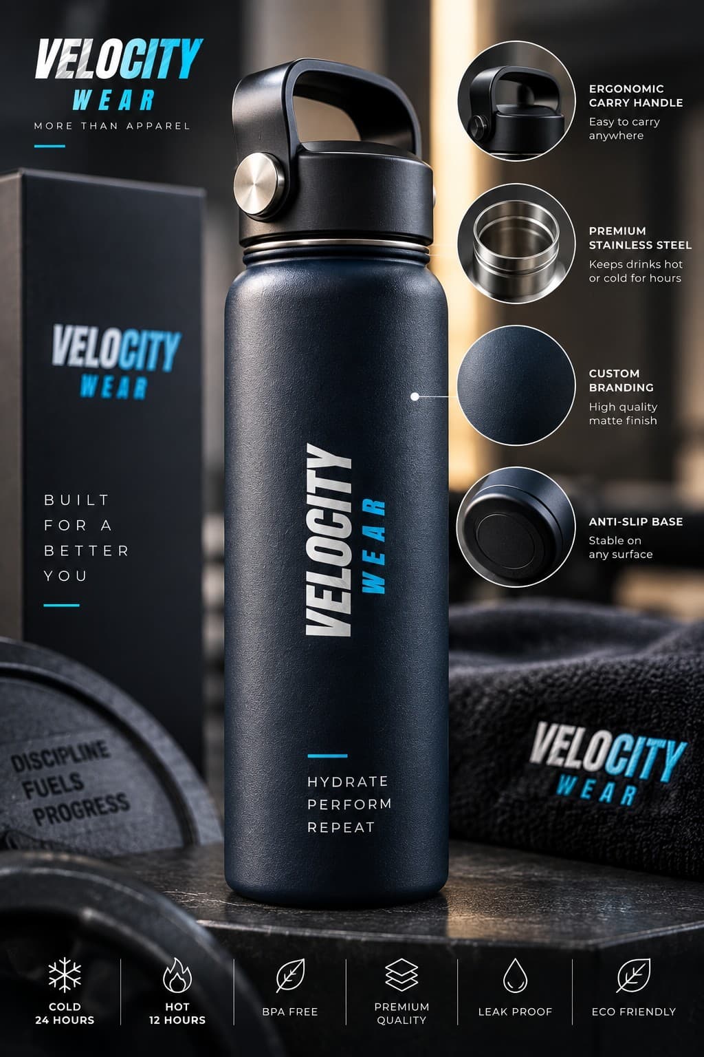
We send back the artwork positioned and scaled on the bottle with the colours identified. Check the version of the logo, check any text character by character, and check whether the size reads the way you pictured it — marks routinely look larger in a flat mockup than they do on a physical object. Approving the proof is what releases the job into the 10 to 15 working day production window.
It is also the last free moment. After approval, a change means redoing the setup rather than adjusting a file, which is the point made in can I change my order after approving artwork. Take an extra day at proof stage rather than a week after it.
What artwork tends to fail on drinkware?
Photographic images, subtle gradients and anything relying on very fine text. All three depend on a flat, forgiving surface and a large area, and a bottle offers neither. Logos with a white element that assumes a white background are another common problem, since the bottle colour is doing that job instead.
Machine-generated artwork deserves a close look before sending, too. Inconsistent stroke weights and malformed letterforms hide well at thumbnail scale and appear immediately on a physical object, a failure mode covered in spotting low-effort AI artwork.
Decide who holds final approval before the proof arrives. Drinkware artwork attracts opinions, because everyone can picture the object and everyone has a view on how large the logo ought to be. One named approver settles it in a day. A group thread settles it in a fortnight, and the production window does not open until it is settled either way.
Send the bottle colour along with the artwork rather than separately. A mark that reads cleanly against white can sink into a dark body, and the pairing of branding and bottle is part of the design decision rather than a detail to be settled after the file has been signed off.