T-Shirts for Restaurants: print or embroidery
By The Velocity Wear Team
Both work on hospitality kit, and the choice is about wash frequency and how formal you want the room to look. Screen printing suits a flat logo at volume; DTF handles detailed or photographic marks with no setup per colour; embroidery reads as the most formal and adds thickness where it sits. A £150 sample, credited against the bulk order, is how you settle it before fifty shirts exist.
Print or embroidery on hospitality t-shirts?
Look at the logo first. A simple wordmark in one or two colours prints cleanly and cheaply by screen, with the setup spread across the run. A detailed illustrated mark — the sort restaurants often have — is a DTF job, since it prints full colour without a screen per colour. Embroidery gives a raised, textured mark that reads as smarter, which is why it turns up more on aprons and polos than on service tees.
Then look at the room. A printed tee reads as casual and works in a counter-service or bar setting. An embroidered chest mark reads closer to a uniform, which suits a more formal floor. Neither is better; they say different things about the place. Our restaurants and hospitality page covers the rest of the uniform, where the same decision repeats on different garments.
Which method survives a commercial wash?
This is where hospitality differs from every other sector. Kit is washed hot, often, and sometimes commercially, and that is harder on decoration than anything a gym or an office will do. Embroidery is stitched rather than applied, so it has nothing to crack, though the thread sits proud and can catch. A well-specified print lasts a long time too — the failures come from mismatches, like a large solid block on a shirt washed daily, or fine hairlines in a screen print.
The garment matters as much as the method. Our tees run 150–240 GSM combed ring-spun cotton, and the heavier weights take repeated hot washing better and hold decoration more stably. A light shirt with a heavy print is the combination that ages worst. Test it: order the sample in the exact specification, wash it the way your team will, and look at it. How the same question plays out on gym kit covers the softer version of this problem.
Where should the branding sit on a service shirt?
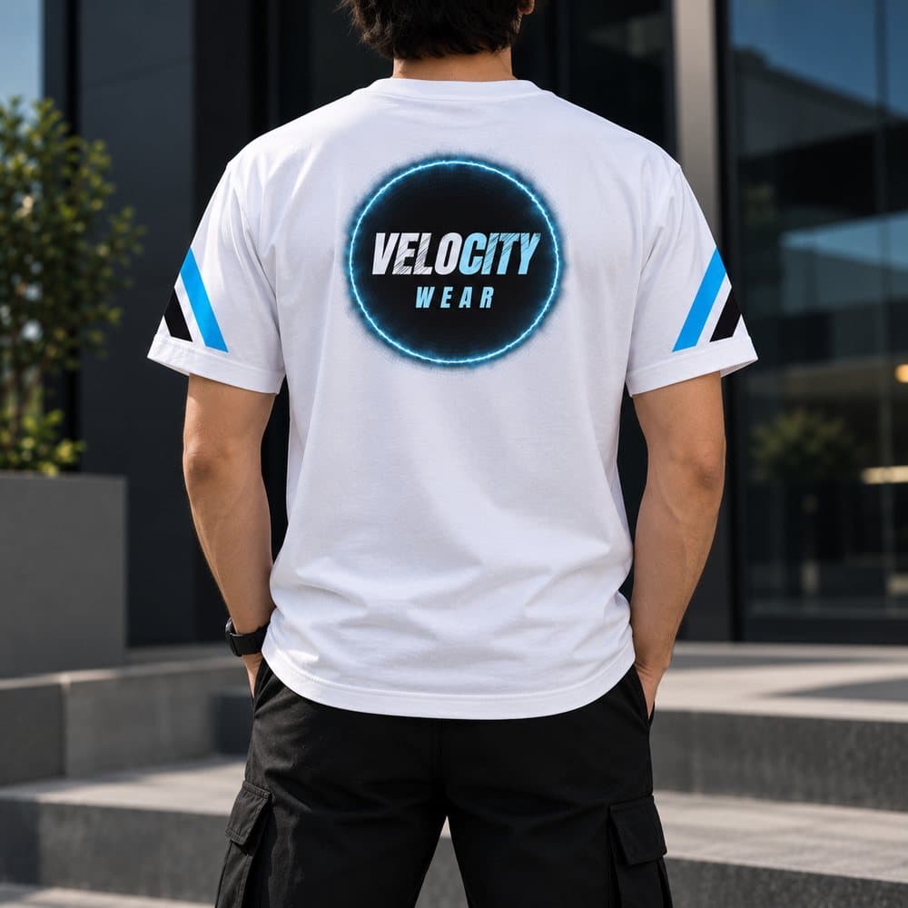
Left chest for anything customer-facing, because it reads at the distance a guest actually stands from staff and does not compete with an apron. A back print works where staff are seen moving across a room, or in a bar where the back of the shirt faces the room more than the front does. Sleeve prints are a nice detail and almost never noticed in service. Each position is its own setup on screen printing, so a chest plus back combination is two, which shows on the quote.
Do front and back of house need different decoration?
Usually not, and keeping them identical is what keeps them as one 50-piece run. If the kitchen genuinely needs to be distinguishable, change the garment colour rather than the artwork — though a colourway needing its own screens counts separately. Whatever you choose, keep the decoration method the same across the team so the shirts age at the same rate and a replacement never looks newer than the shirt beside it. The wholesale t-shirts page sets out the garment options, and how far ahead to order covers fitting the sample stage into an opening date.
What about the shirts you sell to customers?
A shirt sold over the counter is a different product from a shirt issued to staff, even if the logo is identical. It wants private label finishing — a woven or tear-out neck label, a swing tag, packaging that makes it feel bought rather than borrowed — and those are quoted separately from the decoration. It may also want a different garment weight, since a customer is choosing a souvenir rather than workwear. If the artwork is the same, it stays one design and one 50-piece minimum; change the artwork and it becomes a second run.