Print Placement on Polo Shirts
By The Velocity Wear Team
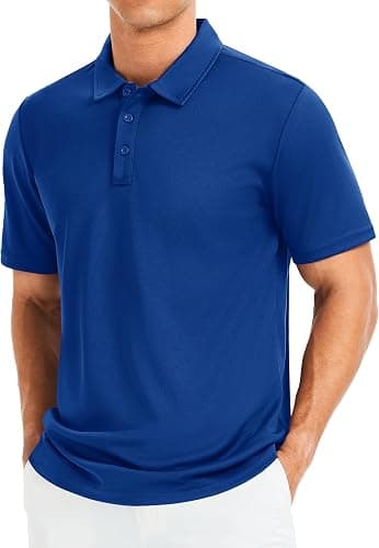
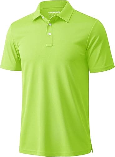
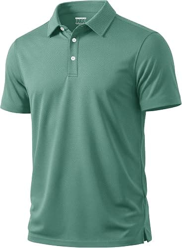
The left chest is the standard polo position, roughly a hand's width in from the placket and level with the armhole. A sleeve mark is the usual second position, a back yoke or centre back the usual third. The placket, the collar seam and the side seams all limit what is possible, so a polo has less usable area than a t-shirt of the same size.
Where does a chest mark actually sit?
Measured rather than eyeballed. The standard left-chest position puts the top edge of the design a set distance below the shoulder seam and a set distance in from the placket edge, and those two numbers are what get written on the spec. Eyeballing it produces a design that creeps upward on small sizes and drops on large ones, because the shoulder seam moves as the garment grades.
Size is the other half. A chest mark around the width of a credit card is the workhorse dimension: readable at conversational distance, small enough to look considered, and comfortably inside the embroidery hoop. Going much larger starts to crowd the placket on smaller sizes and looks like signage. Going much smaller stops being legible at the distance anybody will see it from.
What does the placket rule out?
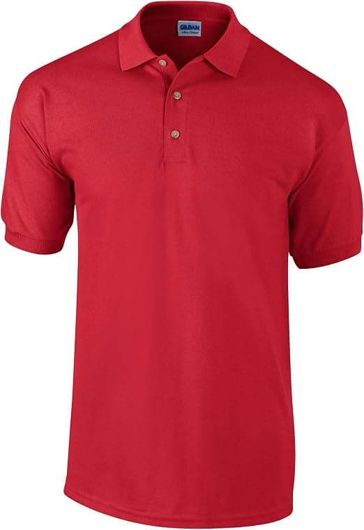
A centred chest design, in almost every case. The buttons and the topstitched placket run straight down the middle of the front panel, so a centred graphic has to either bridge them, which distorts and puckers, or be split, which rarely looks intentional. This catches out buyers who have run t-shirts before, because a centred front print is the default there and impossible here.
The workaround is to move the mark rather than shrink it. A wide design can sit across the chest on one side of the placket, above the pocket line, where a t-shirt would centre it. A design that genuinely must be symmetrical belongs on the back, where the panel is uninterrupted, or on a garment without a placket at all. Decoration method affects what survives being placed near a seam, and embroidery vs puff embroidery on polo shirts covers how each behaves.
Which secondary positions earn their cost?
Sleeves first. A small sleeve mark is visible when the wearer is side-on, which is most of the time in a service setting, and it costs less than a back position because the design is small. The constraint is that the sleeve is a narrow tube, so the design has to be short rather than tall, and it cannot sit too close to the hem or the sleeve seam.
Back positions next. A yoke mark just below the collar seam works for a name or a short word and reads cleanly without turning the polo into merchandise. A full centre-back graphic works for events and retail and looks wrong on uniform. Nape and collar-edge positions are the subtlest option and often the smartest one on a garment you want people to wear off duty. Each position is a separate machine pass and prices separately, so three positions is three line items rather than a bundle.
How do you specify placement so it arrives right?
Give measurements and a reference size. State the position for a medium and let the grading rules handle the rest, rather than giving a separate number for every size. Supply the artwork at the finished dimensions you want, not scaled to fit a page, because a design sent at the wrong scale gets interpreted somewhere along the chain.
Then check it on a sample. A sample is £150, credited against the bulk order, and placement is one of the two things it genuinely settles, the other being colour. The wholesale polo shirts page lists the garment options that affect placement, the glossary page defines the position names, and embroidered polo shirts: a UK buyer's guide goes further into what stitching does at each position.