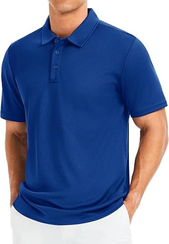
Polo Shirts for Restaurants: print or embroidery
By The Velocity Wear Team
Embroidery is the safer bet for a restaurant polo, because thread does not care about hot washes, grease or the number of times a shirt goes through a machine. Print wins where the logo has fine detail, several colours or a photographic element that thread cannot reproduce. Most venues embroider a small chest mark and stop there.
What does a hospitality wash cycle do to decoration?
It is the harshest test a branded garment gets. Hotter water than domestic laundry, stronger detergent to shift grease, and a frequency measured in days rather than weeks. Embroidery comes through that essentially unchanged, since the mark is stitched into the fabric rather than sitting on the surface. A print on the right fabric with the right specification holds up well too, but it has more ways to go wrong, and in a kitchen it will find them.
The exception is a performance knit, where sublimation belongs on polyester and behaves differently from a surface print entirely. Fabric and decoration are one decision rather than two, which is why the wholesale polo shirts page lists them together.
When does a logo force a print?
- Thin script type, which stitches into an unreadable line at chest size.
- More than a handful of colours, where thread counts climb and the patch stiffens.
- Gradients or photographic elements, which thread cannot render.
- A large back mark, where embroidery would add noticeable weight to the shirt.
Screen printing suits a long run with few colours. DTF handles detail and colour count without needing a screen per colour, which makes it the usual answer for a complicated hospitality logo on a small run. Whichever method you land on, the logo needs to be vector with the type outlined — a logo pulled off a website is rebuild work that happens before production starts.
How many positions does a restaurant polo need?
One, in most cases. A small chest mark reads as uniform, which is the point. Adding a back mark doubles the setup and mainly benefits venues where staff are seen from behind across a large room. Sleeve marks are largely decorative on a work shirt and are the first thing to cut if the quote comes in high, since removing a position removes a whole setup line rather than shaving a few cents off each shirt.
Where branding matters beyond the logo, private label finishing does more for less noise: a woven neck label or a tear-out label makes the shirt feel like yours without another mark on the outside. The restaurants and hospitality page covers how that sits alongside the rest of a venue kit.
How do you prove it before ordering 150 shirts?
Sample it and abuse it. £150, credited against the bulk order, and the useful test is not looking at it — it is putting it through a service and then through the venue wash a few times. If the mark still looks right after that, the specification is right. How restaurant polo samples work covers what else to check while you have one, and piqué, fit and embroidery explains how the two fabrics take a stitched mark differently.
What does the artwork need to look like?
Vector, with the type outlined, and supplied at the size it will be used. Hospitality logos are frequently designed for a menu or a sign and then handed over for a chest mark, where fine strokes and small type stop working. Ask your designer for a simplified version intended for garments, in a single colour if possible; it usually stitches better, prints cleaner and costs less. The same simplified mark then works on aprons, caps and anything else the venue orders, which saves the whole exercise being repeated the next time something is branded.