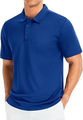
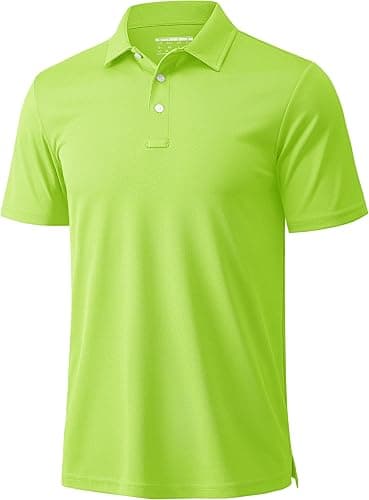
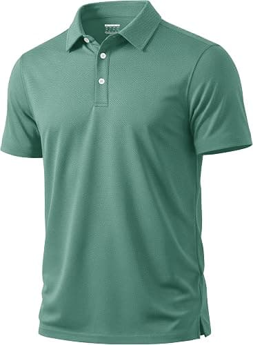
Polo Shirts for Offices: print or embroidery
By The Velocity Wear Team
Embroidery is what most offices choose, because stitching reads as considered and holds its appearance through years of washing. Print is the better answer when the logo has very fine type, a gradient, or more colours than thread can sensibly match. Both start from the same $18 garment price at the fifty-piece minimum, so this is an artwork decision rather than a budget one.
Why does embroidery suit corporate kit?
A stitched badge has physical depth, and against a piqué knit it catches light in a way a flat print does not. It also ages well: after fifty washes the thread is still thread, where an entry-level print on the same garment has begun to look tired. For an office polo that will be worn in front of clients for two or three years, that difference is the whole argument. The fabric and finish options sit on the wholesale polo shirts page.
The limit is resolution. Thread has a minimum width, so type below about four millimetres tall closes up, and very thin outlines disappear into the knit. If your brand mark carries a strapline or a registered symbol at that scale, either drop those elements from the stitched version or move to print. Embroidered polo shirts: a UK buyer's guide covers how logos are redrawn for stitching.
How big should the chest logo be?
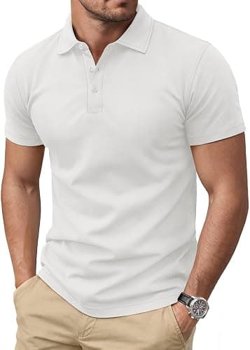
Between about seven and ten centimetres wide for a left chest mark, depending on whether your logo is wide or tall. Wider than that starts to look like a promotional giveaway rather than a uniform; smaller than that and it stops reading across a meeting room. Height matters as much as width for a stacked logo, and the safest approach is to print the artwork at the intended size on paper and hold it against a shirt before approving anything.
Placement is the other half. A left chest badge should sit roughly in line with the second button and a hand span in from the placket, so it stays clear of the fold when the polo is worn open. Sleeve marks work well as a secondary position for a department name or a second brand, and a small back-neck mark is a quiet option for firms who want the logo present without it being the feature.
What about a multi-colour or photographic logo?
DTF handles it. It prints the artwork exactly as supplied, including gradients and photographic detail, so nothing has to be simplified into thread shades. Screen printing is the alternative for flat colour at larger sizes, priced per colour because each colour needs its own screen. Sublimation is available where the design needs to run edge to edge on a suitable fabric rather than sit as a badge. The whole method list, and which garments suit which, is covered on the corporate page.
Can you add names or departments?
Yes, and it is a common request for reception teams, events staff and anyone wearing the polo in front of visitors. Individual names are added as personalisation on top of the shared design, which keeps the order inside one fifty-piece minimum rather than turning fifty people into fifty designs. Collect the spellings with the sizes, as polo shirts for offices: size splits suggests, because a misspelled name is the one error a polo cannot hide.
The last decision is whether anything goes on the back. Most offices leave it plain, and for a client-facing garment that is usually right. A back mark earns its place where staff have to be identified at distance, on an exhibition stand or at an open day, and in that case it should be a plain wordmark sized to read across a room rather than the full logo with everything attached to it.