How Do I Stop My Uniform Looking Cheap?
By The Velocity Wear Team
Need this made?Get pricing for this product— free, no obligation, 50 pieces minimum.
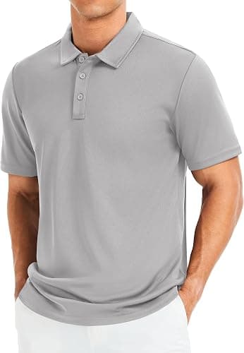
Uniform looks cheap for three reasons, and price is usually not one of them: fabric that is too light for the job, a fit that ignores body shape, and a logo printed far larger than it needed to be. Fixing all three costs very little. A heavier polo with a small embroidered chest logo reads as considered, while a thin one carrying a palm-sized print across the front reads as a giveaway, even when the two garments cost within pennies of each other.
Weight Is the First Thing Anyone Notices
Nobody inspects a seam, but everybody feels the fabric when they put a garment on. Thin polos go translucent under strong light and lose their collar shape within a month of washing. Thin hoodies pill at the cuffs. Moving up a weight band is the cheapest quality upgrade available, and it shows immediately. If you only change one thing about your specification, change the GSM before you change anything else.
Fit Does More Damage Than Fabric
A well cut mid-range garment beats a badly fitted premium one every time. Ordering a single unisex block for a mixed team means half of it will hang wrong, and a garment that hangs wrong looks cheap regardless of what it is made of. Where a women's cut is offered alongside the unisex, use it. Sleeve and body lengths on the extreme sizes are worth checking too, because that is where a cut usually breaks down.
The Logo Is Almost Always Too Big
This is the single most common mistake in branded staff clothing. A large chest logo is a habit borrowed from promotional giveaways, and it signals exactly that. Left chest embroidery at a modest width, or a small tonal print, tells people you chose the garment rather than the advertising space. If the brand genuinely needs to be readable across a room, put the bigger version on the back.
Colour Discipline Across the Range
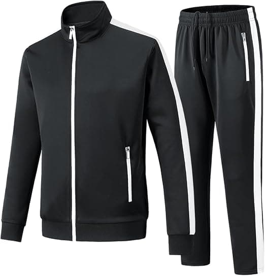
Mixed uniform falls apart when the navy softshell, the navy polo and the navy cap are three slightly different navies. Fabric type changes how a colour reads, and a woven jacket will never match a knitted polo perfectly. Two approaches work: keep everything in one colour and accept small variation, or split deliberately, with dark bottoms and one accent on top, so that nothing is pretending to match in the first place.
The Method Sends Its Own Signal
Embroidery reads as permanent and deliberate. A heavy print on a light polo reads as an event tee. Neither is objectively better, but they carry different associations and people pick those up without thinking about it. For customer-facing staff, embroidery on the top layer is usually worth the extra. For a warehouse team, a durable print on a robust tee makes more sense and nobody expects otherwise.
The Signals People Read Without Realising
When someone says a uniform looks cheap, they are reacting to a specific set of cues. These are the ones that come up again and again.
- Collars that have gone wavy or lost their shape after a handful of washes.
- A chest logo wide enough to read from across a car park.
- Three garment types in three slightly different shades of the same colour.
- Print cracking or vinyl corners lifting on garments still in daily use.
- Sleeve and body lengths that obviously do not fit the person wearing them.
“"A uniform stops looking like a uniform the moment somebody would happily wear it home. That is the whole bar."”
Fewer Items, Better Chosen
Budgets get spread too thin across too many garment types. Two polos, one mid layer and one jacket per person, all properly specified, beats five items that are each slightly disappointing. Cut the item count first and put the saving into weight and fit. Staff also wear a smaller range more consistently, which is half the point of having a uniform at all.
Replace on a Schedule, Not on Complaint
Even good uniform ages, and a team where some people are wearing year-one garments and others are wearing year-four garments always looks scruffy. A set replacement rhythm keeps everyone visually consistent, and consistency is most of what people mean when they call a uniform smart. It also lets you order in planned batches rather than emergency ones, which tends to be cheaper anyway.