How Do I Choose a Hoodie Colour for Merch?
By The Velocity Wear Team
Need this made?Get pricing for this product— free, no obligation, 50 pieces minimum.
Choose the colour your artwork prints cleanly on and your audience will genuinely wear, which in practice means building the core of the range around black, a mid heather grey, navy or an off-white, and treating anything bolder as a second colourway you add once the safe one has proved itself. Garment colour affects print cost, print appearance, photography and resale rate all at once, so it is a commercial decision rather than a taste one.
Start From the Artwork, Not the Mood Board
The first question is not which colour you like. It is which colours your logo survives on. A single-colour white mark works on everything dark and disappears on cream. A design with dark outlines needs a light or mid base. Anything with a fixed background shape is fighting the garment colour rather than using it. If your brand asset only exists in one version you will be limited to bases that suit it, and the fix is a reversed version made now rather than compromising on garment choice every order.
The Four Colours That Carry Most Ranges
There is a reason the same shortlist appears across almost every successful merch range. These are the bases that sell, photograph and print reliably.
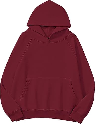
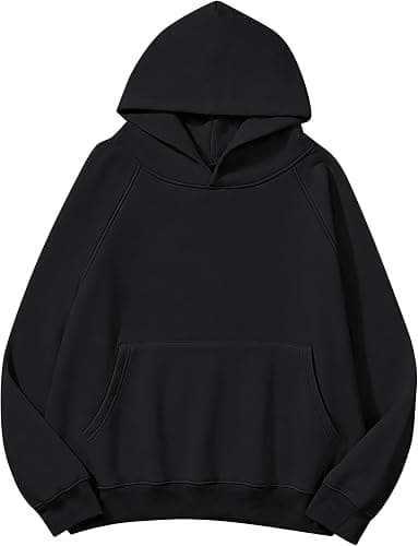
- Black: the default for a reason. It flatters most body shapes, hides wear, makes bright prints pop, and it is what people reach for. It also shows lint and fades over years.
- Heather grey: the friendliest base for photography and the easiest to style. Prints read softly against it, and it looks less like uniform than a solid colour does.
- Navy: black for people who find black too severe. Excellent with white, cream or metallic-effect prints, and a strong choice for anything that needs to read as smart.
- Ecru, sand or off-white: the current premium signal in streetwear-adjacent merch. Prints beautifully, marks easily, and reads as considered rather than promotional.
- One accent colour: worth adding only after the core has sold, and only if it means something to your audience such as a club colour or a campaign shade.
Heather Grey Is Not One Colour
Heather and marl fabrics are made by blending different coloured fibres, usually with polyester content in the mix, so the base you print onto is visually flecked rather than flat. Two things follow. Prints pick up a slight texture, which reads as characterful on a bold graphic and messy on fine detail. And because heathers depend on a fibre blend rather than a single dye bath, the shade varies more between production runs than a solid colour does. Lovely base, just not the one to pick if you need two garments to match exactly.
Dark Bases Cost More Ink and Sometimes More Money
Printing light colours onto a dark hoodie needs a white underbase, an extra layer that stops the garment showing through. In screen printing that is an extra screen with its own setup cost per colour. In DTF and DTG it is more ink and a slower pass. The finished print also sits higher and feels less soft than the same design on white. None of that is a reason to avoid dark garments, and black hoodies remain the best sellers in most ranges, but it does mean a three-colour design on black is a meaningfully different quote to the same design on ecru.
Where Brights and Pastels Genuinely Work
Bold colour is not a mistake, it is a targeting decision. A university society, a festival crew, a children's club or a campaign with a strong colour identity can all justify a saturated base, because the colour is doing work the design does not have to. Pastels suit lighter-weight hoodies and spring drops. Where brights fall down is general-audience merch bought by adults who already own six hoodies, because what determines whether merch is worn again is whether it goes with what the wearer already has.
Splitting a Small Run Across Colours
The minimum order is 50 pieces per order with sizes mixed freely, so you are technically free to split a run. Think carefully before you do. Fifty pieces across three colours leaves you with six or seven of each and no usable size curve in any of them, so somebody always ends up in the wrong size. There is a production consideration too: a design printed on both a dark and a light base usually needs two versions of the artwork, because what works over a white underbase is not what works directly onto cream. One colour done properly beats three done thinly.
“"A colour that photographs badly will not sell, however good it looked hanging on the rail."”
Photograph It Before You Commit to It
This is the check almost nobody does, and it is the most useful one. Merch is sold in photographs, seen on a phone, at thumbnail size, scrolled past in under a second. Before you commit, look hard at how your chosen base behaves in that context. Black loses all garment detail in photos unless it is lit carefully, so seams, drawcords and the hood shape simply vanish. Very pale bases blow out against a white background. Mid heathers and navies photograph most forgivingly. Then check your logo at thumbnail scale: if it turns into a grey smudge, the problem is contrast against that base, and the answer is a different base rather than a bigger logo.
You can lay out and preview your design on the garment in the free Design Studio before ordering, and the instant price calculator will show you what the underbase on a dark garment does to your cost per piece. Both are worth using before you settle on the colourway.