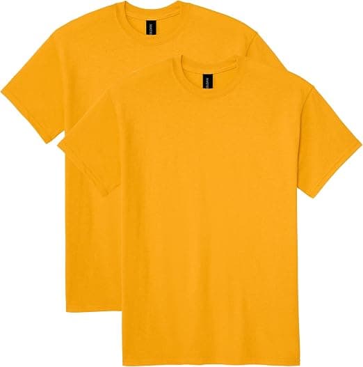
Dark vs Light Garments for Printing: The Real Trade-Off
By The Velocity Wear Team
Need this made?Get pricing for this product— free, no obligation, 50 pieces minimum.
Light garments print cheaper, faster and more accurately, because the ink sits straight on the fabric. Dark garments look better on a rail, hide marks and wear, and suit most merch and workwear, but printing on them generally needs a white underbase first. That underbase adds a screen, adds a pass, and subtly changes the final shade of every colour above it. Almost every dark versus light decision comes back to that one fact.
Why Dark Fabric Needs White Ink Underneath
Printing inks are not fully opaque. Put a mid-blue directly onto black cotton and the black shows through, so the blue reads muddy and dull. To make a colour look like the colour, the printer lays a white layer down first in the shape of the design, then prints the colours on top of it. That white layer is the entire reason the artwork looks bright rather than sunk into the fabric.
The same logic applies to any mid or dark base, not only black. Navy, forest, burgundy, charcoal and most heather greys all pull colour towards themselves. Marls catch people out most often, because they photograph as light but behave like a mid-tone once ink goes on them.
What the Underbase Does to Your Colours
Here is the part that surprises brands. Even with a good underbase, a colour printed on dark does not always match the same colour printed on white. The white layer is a printed film rather than a paper surface, so the ink above it reflects light slightly differently. Expect brand colours to read a touch cooler or flatter on a dark garment.
If exact colour matching matters, ask for the reference to be checked against a printed sample on the actual garment colour, not against a screen. Two garments in the same order, one black and one white, will not produce identical brand blues. Far better to know that before approval than after delivery.
Where the Extra Cost Actually Shows Up
In screen printing, setup is charged per colour, and the white underbase counts as a colour. So a design you think of as two-colour becomes three screens on a dark garment. Across a large run that extra setup is spread thin and barely registers per unit. On a short run it is proportionally significant, which is exactly why small quantities on dark garments are where screen printing looks least competitive.
DTF works differently. The white layer is built into the transfer itself, so there is no separate per-colour setup and dark garments cost the same to decorate as light ones. For short, colourful runs on black, that is normally the more sensible route.
Method by Method: What Changes on Dark
Not every decoration method is affected the same way, and one of them cannot go near a dark garment at all.
- Screen printing: needs an underbase on dark, which adds a screen and a pass, and shifts the finished shade slightly.
- DTF: white is already in the transfer, so dark and light cost the same, though the print sits on the surface and is more noticeable against a dark base.
- DTG: works on dark but requires pretreatment plus a white underbase, using more ink and giving a firmer hand than the same design on white.
- Sublimation: cannot print dark at all. The dye is translucent, there is no white, and it only works on polyester in light bases.
- Embroidery: unaffected by garment shade because thread is opaque, though thread colour choice matters more on dark for contrast.
The Design Move That Removes the Underbase Entirely
This saves real money and almost nobody plans for it. If your design works in white ink only, there is no underbase, because white on black is a single screen. A one-colour white print on a dark garment is one of the cheapest, boldest and most durable things you can produce, and it reorders easily because there is only one screen to remake.
So when you draw the artwork, build a single-colour version that works in white on dark and in your brand colour on light. You then have one design that runs cheaply across both ends of the garment range, and you keep the full-colour version for the pieces where it genuinely earns its place.
“"White ink is the invisible line item. You never see it on the finished garment, but you pay for it on every dark one."”
Choosing the Base Colour With Eyes Open
Dark garments are the right answer more often than the cost picture suggests. They hide marks, they photograph well, they suit hospitality and workwear where staining is a daily reality, and buyers reach for black merch. Light garments are the right answer when the artwork is photographic or full colour, when the run is small, when you want summer weight, or when you are using sublimation and have no other option.
Run both through the instant price calculator at your real quantity before deciding. The gap between dark and light narrows sharply as quantity rises, so a decision that looks obvious at 50 pieces can flip completely at a few hundred.