Print Placement on Tracksuits
By The Velocity Wear Team
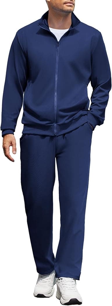
The standard tracksuit placements are a left chest mark on the top, a larger print between the shoulder blades, and a small logo on the upper thigh of the jogger. A set hands you two garments to brand, so the useful move is varying the scale between them rather than repeating one mark twice at the same size.
Where does a logo belong on a co-ord set?
On the top: left chest at roughly 8 to 10 cm wide, a back print between the shoulder blades at 25 to 30 cm, a sleeve or cuff for a small secondary mark, and the hood itself for something seen from behind. On the jogger: upper thigh, side seam, or the lower leg just above the ankle cuff.
The thigh is the position most buyers underuse. It is visible while somebody is standing and it does not compete with the top, which is why it works far better than repeating the chest logo down the leg. The print placement guide covers the positions across other garments.
Decide what each placement is for before you choose it. One mark should be readable at conversational distance, which is the chest or the thigh, and one should be readable across a room, which is the back. A set carrying three marks all sized for close range does not travel any further than a set carrying one.
What sizes hold up on a hood and a thigh?
Smaller than instinct suggests. A thigh print wider than about 12 cm distorts as the leg moves and tends to cross a seam, and a hood print over roughly 10 cm wraps around the curve and reads crooked once the hood is down. The back panel is the only genuinely flat area with room on a set.
Curved and seamed areas are the constraint everywhere else. A pocket, a drawcord channel, a zip or a side seam all interrupt a print, and a design laid across one will never sit flat. Check the garment rather than the mockup.
Which placements add to the cost?
Every placement is a separate operation, so a chest plus a back plus a thigh is three passes instead of one. That is where a set differs from a single garment: branding both halves doubles the handling before you have added a second colour. The wholesale tracksuits page quotes $53 a set from a minimum of fifty, with decoration priced alongside it.
Volume softens the effect. Up to 35% comes off the set price as the order grows and setup spreads across more pieces, so a three-placement design is proportionally less expensive at five hundred sets than at fifty. Settle the placements before quoting, because one added afterwards is a new operation rather than an adjustment.
How do you spec placement so it repeats?
Give a measurement from a fixed point, never a description. Centre of the design, so many centimetres down from the shoulder seam and so many across from the centre front. A note saying the logo sits on the chest will be interpreted, and interpretation varies from one run to the next.
Ask for a photograph of the first piece off the line rather than a digital proof alone. A mockup shows intent while a photograph shows where the print actually landed on the garment, and the two diverge far more often on a curved panel than on a flat one.
Write the artwork width as well as the position, in centimetres rather than as a percentage. Our terminology glossary covers the reference points a factory works from, and the logo placement guide shows the standard measurements on other garments.