Colour Matching Bulk Tracksuits
By The Velocity Wear Team
A tracksuit top and jogger match because both halves are cut from the same fleece batch and the same dye lot. Matching by colour name across two separate orders does not work, because greys and navies drift between batches. A Pantone reference gets you close on fabric, but dyed cloth and printed ink never land on exactly the same value.
Why does a Pantone look different on fleece?
Pantone references are defined on coated paper under controlled light. Fleece is a brushed, textured surface that scatters light rather than reflecting it evenly, so the same value reads darker and softer. Add a brushed back and the shade shifts again depending on which way the nap is lying.
That is not a failure to match, it is what the material does. Give the reference as a target, ask for something physical to approve against, and judge it in daylight rather than under a shop light. Our colour glossary explains the terms that turn up on a dye report.
The light source is the other half of the problem. Two fabrics that agree in daylight can separate under the warm light of a shop or the cool light of a warehouse, which is a known effect rather than a fault in either of them. Choosing one light to approve under, and writing down which it is, heads off a later argument about whose eyes were right.
How do the top and the jogger end up the same colour?
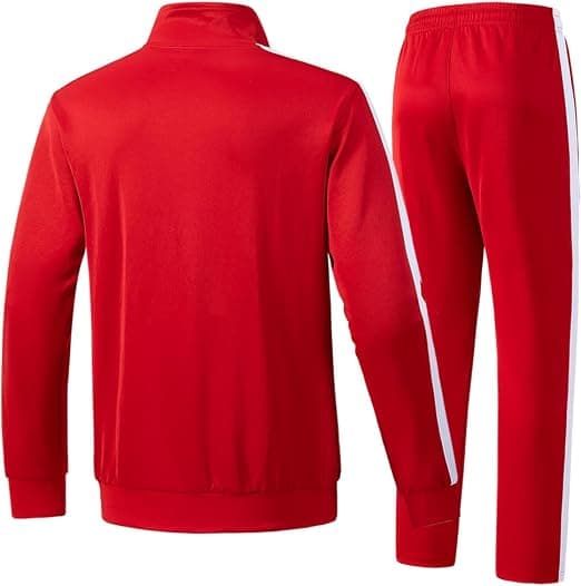
Both are cut from one fleece batch in one dye lot, so the two halves have no chance to drift apart. That is the whole reason a co-ord is ordered as a set instead of as a hooded top and a jogger from two separate product lines, and it is set out on our tracksuit sets page.
Buyers who assemble a set from two suppliers usually discover this too late. Two greys sold under the same name by two factories read as two colours under shop lighting, and nothing can be done about it after production. Can two different garments match in colour goes through why.
What batch variation is normal?
A small shift between dye lots is normal across the industry and is measured rather than judged by eye. Inside one order it should not be visible, because one order is one lot. Between a first run and a repeat six months later a slight difference is possible, and it is worth planning for if the two will sit side by side on a rail.
If colour consistency across repeat orders matters to you, say so at quote stage. Keeping a retained sample from the first run and matching later lots against it is the practical way to hold a colour steady over time.
Deep colours move the most. Black, navy and charcoal carry the largest dye loads and therefore the widest room for variation, while mid tones and heather greys behave more predictably. If you are choosing a colourway you intend to reorder for years, that is worth knowing before it becomes the brand colour.
What should the order actually specify?
The Pantone reference, whether it applies to the fabric or the print or both, and what you intend to approve against. Print and dye are different processes, so a logo printed in the same reference as the garment will not vanish into it. It sits slightly apart, which is usually what you wanted anyway.
Where a brand colour has to be exact, screen printing mixes ink to the reference and is the more dependable route. Colour matching in custom apparel covers how close each process gets. Sets start at $53 at the fifty-set minimum, with up to 35% coming off across the volume bands.