Joggers for Gyms: print or embroidery
By The Velocity Wear Team
For a gym, a small embroidered logo on the thigh is the most durable choice, and a screen printed wordmark down the leg is the most economical at volume. DTF sits between them and handles detail that screens cannot. The deciding factor is rarely price. It is the artwork itself and the fabric it has to sit on.
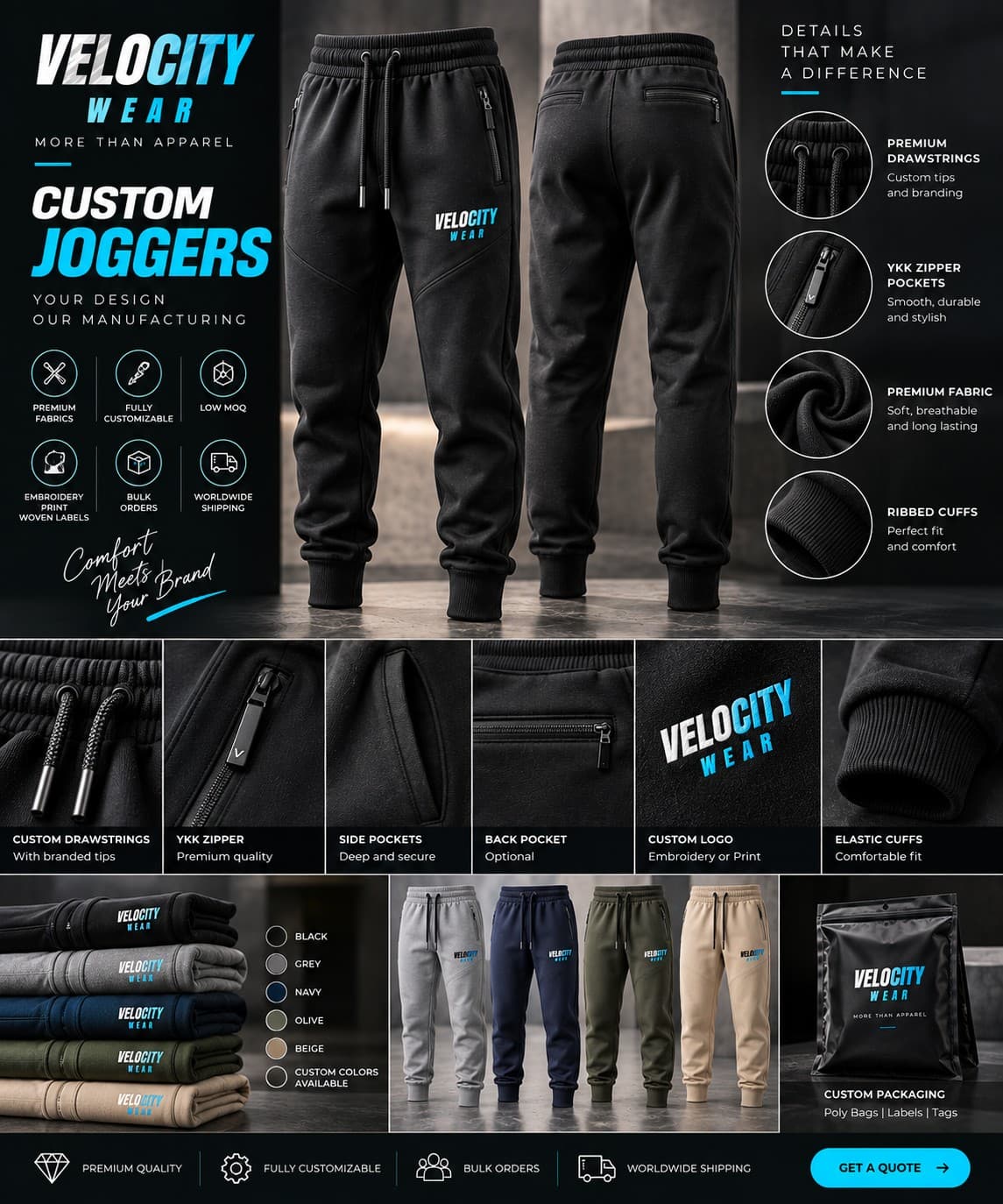
Gym kit gets washed more than almost anything else a brand puts its name on, which pushes the decision towards methods that survive repetition rather than ones that photograph best on day one. The wholesale joggers page lists the fabrics, and the gyms and fitness page shows how the same mark usually needs to work across several garments at once.
Which method suits a jogger leg best?
Embroidery, for anything small and simple. A thigh logo is a small area on a garment that bends constantly, and stitched thread moves with the fabric instead of sitting on top of it. Screen printing takes over when the design is larger, flatter and running in quantity, because the cost of the screens spreads across the pieces. 3D puff raises a bold, simple shape off the surface and looks deliberate on a leg; sublimation is for all-over colour rather than a logo.
What does brushed fleece do to a print?
It softens the edges. The napped inner face is what makes brushed fleece comfortable, and the outer face carries a shorter version of that texture, so a very fine line laid on top of it loses a little crispness. Loopback is flatter and holds detail more cleanly. Neither is a problem if you know it in advance: artwork drawn with slightly heavier strokes prints well on both, and a stitched mark is unaffected either way.
When is embroidery the wrong answer?
When the design is big, when it has many colours, or when it contains fine text. Embroidery is priced by how much thread goes into it, so a dense or large design becomes expensive quickly, and the relationship is explained properly in how stitch count affects cost. Small lettering also fills in once it is stitched. If your gym logo has a strapline under it, either drop the strapline for the joggers or print instead.
Where on the garment should the mark go?
- Upper thigh, front left: the default, visible when standing, clear of the seams.
- Below the hip on the outer leg: works for a vertical wordmark and sits well in photographs.
- Back of the waistband or the rear pocket area: subtle, and useful when the top half of the set already carries the logo.
- Avoid the knee entirely. It is the part of the leg that flexes most and it wears fastest.
If the joggers are part of a wider kit, decide the method once and apply it across the range. The trade-offs are the same ones set out in print versus embroidery on hoodies, and a gym whose hoodie is embroidered and whose joggers are printed rarely looks like it meant to do that. Order a sample before committing, especially on fleece, since the £150 is credited against the bulk order and a texture question is impossible to settle on screen.
Think about scale before you think about method. A logo that works across a hoodie chest is usually too large for a jogger thigh, and shrinking it is not always enough, because detail that reads at 250 millimetres disappears at 80. Gyms whose logo includes a strapline, a founding date or a thin outline often need a simplified version drawn specifically for small applications. That version is worth having regardless, since it will be used on caps, towels and anything else with a small decoration area. Draw it once, approve it once, and every future order moves faster.